Client

NREP

NREP

Industry

Real Estate

Real Estate

Challenge

Creation of a brand strategy (from naming, positioning and messaging to the logo and key visual) for a new rental apartments platform that will be a combination of Scandinavian solidity and Polish hospitality. Introducing a brand to the Polish market that in terms of its image, also exudes freedom, safety and simplicity of service.

Brand strategy for Lett, a housing platform by a Nordic private equity firm

Main Project Image
Main Project Image
Main Project Image

You are at home

Lett crew believe renting an apartment should be as normal as owning one. Lett offer high-quality living for everyone whether you are a student or have a family with three kids. Apartments are carefully designed to consider the needs of good living. The materials are durable and there is a place for everything. They did not forgott about the interior design either – carefully selected furniture complements the look and feel. You know what you want from your home. We take care of the rest.

Large Project Gallery Image #1
Project Gallery Image for 50% width of the screen #1
Project Gallery Image for 50% width of the screen #2
Large Project Gallery Image #3
Large Project Gallery Image #4

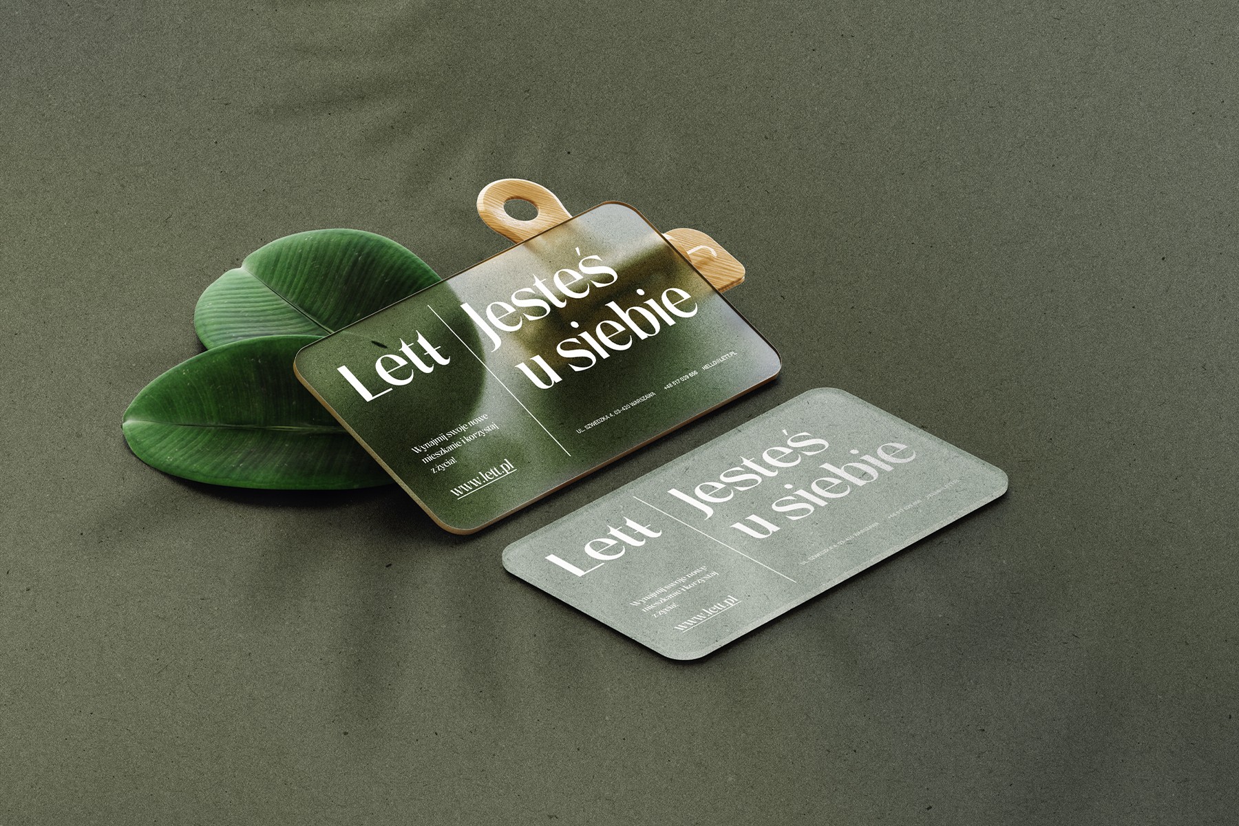
Scope of work consisted of naming, messaging, logo and most importantly key visual.

Our task was to crate compeling brand strategy that will fit into Polish culture yet will also refer to NREP Scandinavian roots and symbols.

  • The image featured in the carousel #1
  • The image featured in the carousel #2
  • The image featured in the carousel #3
  • The image featured in the carousel #4
  • The image featured in the carousel #1
  • The image featured in the carousel #2
  • The image featured in the carousel #3
  • The image featured in the carousel #4
  • The image featured in the carousel #1
  • The image featured in the carousel #2
  • The image featured in the carousel #3
  • The image featured in the carousel #4